Viking Line
Digital Cruise experience
We won the iF award for service design with the design. Honored!
Summary.
This is a digital strategy project for one of the largest cruise line companies in the Nordics.
To illustrate the use cases of the app I created a video for internal use, which was so well received that Viking Line requested me to do this video with professional actors.
This shows most of the use cases while on board. It is used by Viking Line in their marketing material as well.
Several rounds of user research sessions were held to create the first version of the digital experience.
The second version took what we envisioned the first version to be like minus the features that we got either negative feedback from or the analytics showed little or no interaction.
The team & my role.
Duration: 12 months
Team: 3 User researchers, 3 Service Designers, 2 User Experience Designers, 1 Design Strategist, 1 Visual Designer, 3 Developers, a sales guy.
I did the user experience design and parts of the strategy scoping.
A year and a half later I created a second version of the app with another UX designer, a visual designer and the same group of developers.
The problem.
Essentially the problem with sea travel is the lack of WiFi, or cellular reception.
Satellite uplinks are of course available and that's how the on-board WiFi on airplanes work as well.
But whereas an airplane is a hollow tube made of paper-thin aluminium, carrying a few hundred people, the modern cruiseliner is a one, giant behemoth of interconnected Faraday cages. There is no signal strong enough to permeate it's walls or to cater to it's thousands of passengers.
Browsing the web on the seven seas is no smooth sailing. It's more like the browsing experience the year Prince had his big shindig.
So, when we took on the task to bring digital services on board Viking's fleet, we basically made an intranet for passengers.
Let's think about it for a second: WhatsApp doesn't work, Safari barely hangs in there, no Tinder, no Instagram, tweets become croaks and it's just no fun at all.
We needed to make the online world live on the boat without access to the services people are used to.
This of course was remedied for the second version as better uplinks are becoming cheaper and more readily available.
Thousands of ideas.
Before we started on the design process, we, together with Viking Line, held an internal competition for the ship staff to come with ideas how a mobile application could make their work easier and serve the passengers better.
The app needs to both ways, help the staff and serve the passengers.
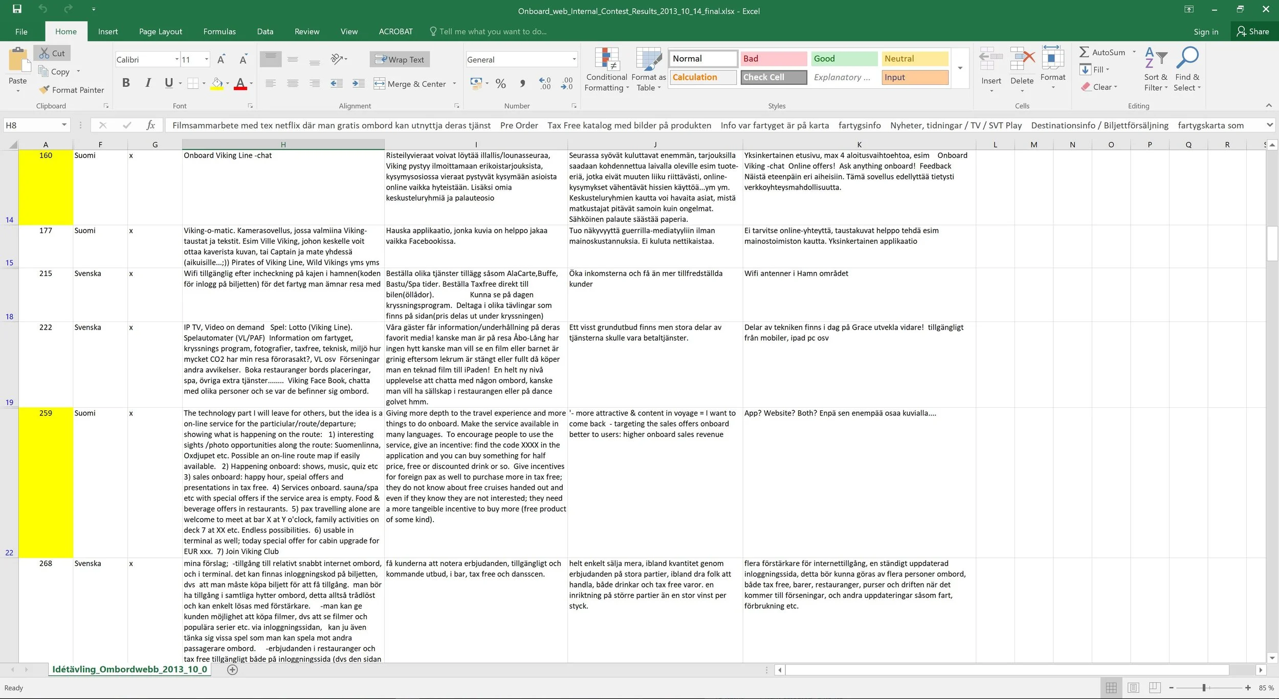
This Excel sheet is the bank of ideas we collected.
Contextual interviews were conducted on location right there, without additional luring or recruiting.
Using the Excel sheet created from the internal contest, we discussed with Viking Line to identify the key touchpoints where we want the users' input.
Based on the focus group sessions, the contest document and stakeholder workshop, we created this small video and the accompanying UI mock-up to show the user journey.
This image illustrates the user journey of the various touchpoints that we could enhance with a digital layer.
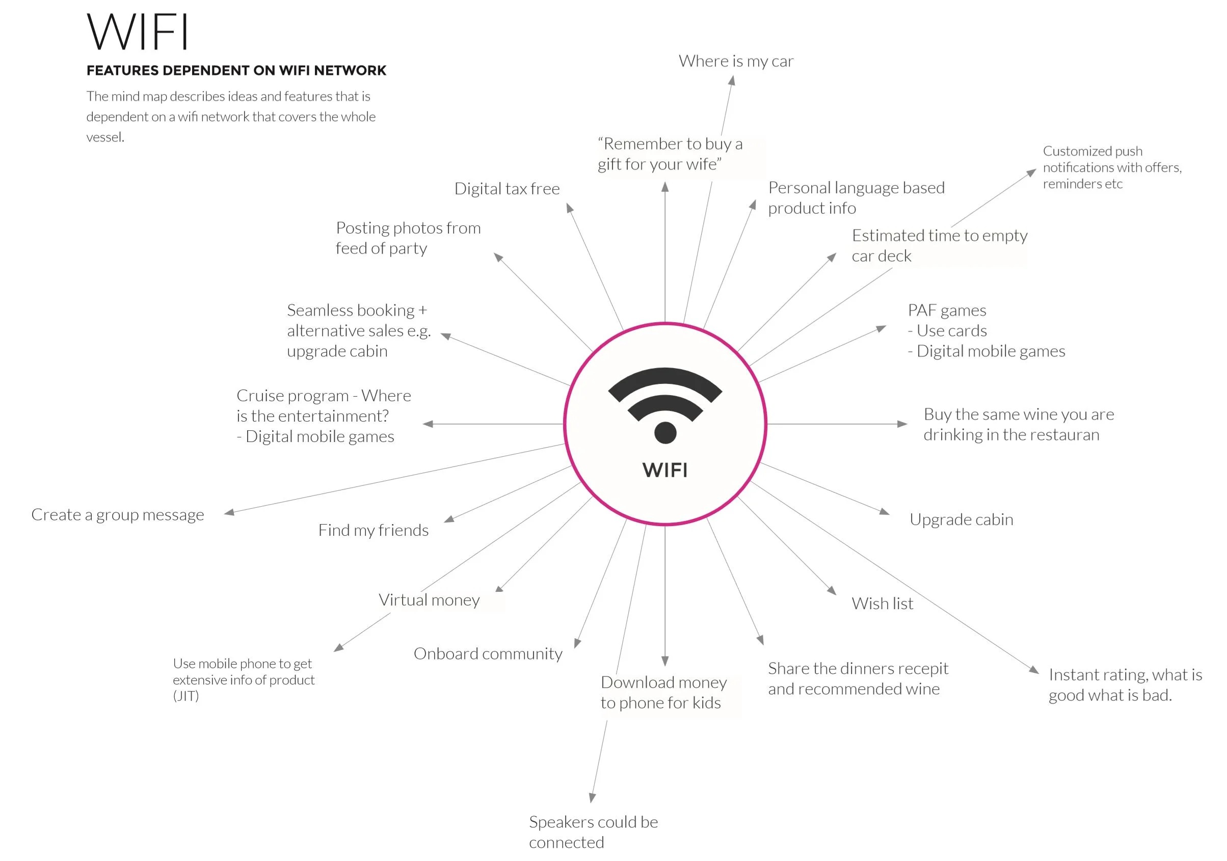
In order to make the app work, we needed to create a map of what works on-board, what works when the user has a trip booked and trip is approaching and what works when the user doesn't have a trip booked.
The infographic above shows what touchpoints on the app are dependent on whether the phone is connected to the ship's internal network.
For example, you can't use the social functions like chatting with fellow passengers if you are still ashore.
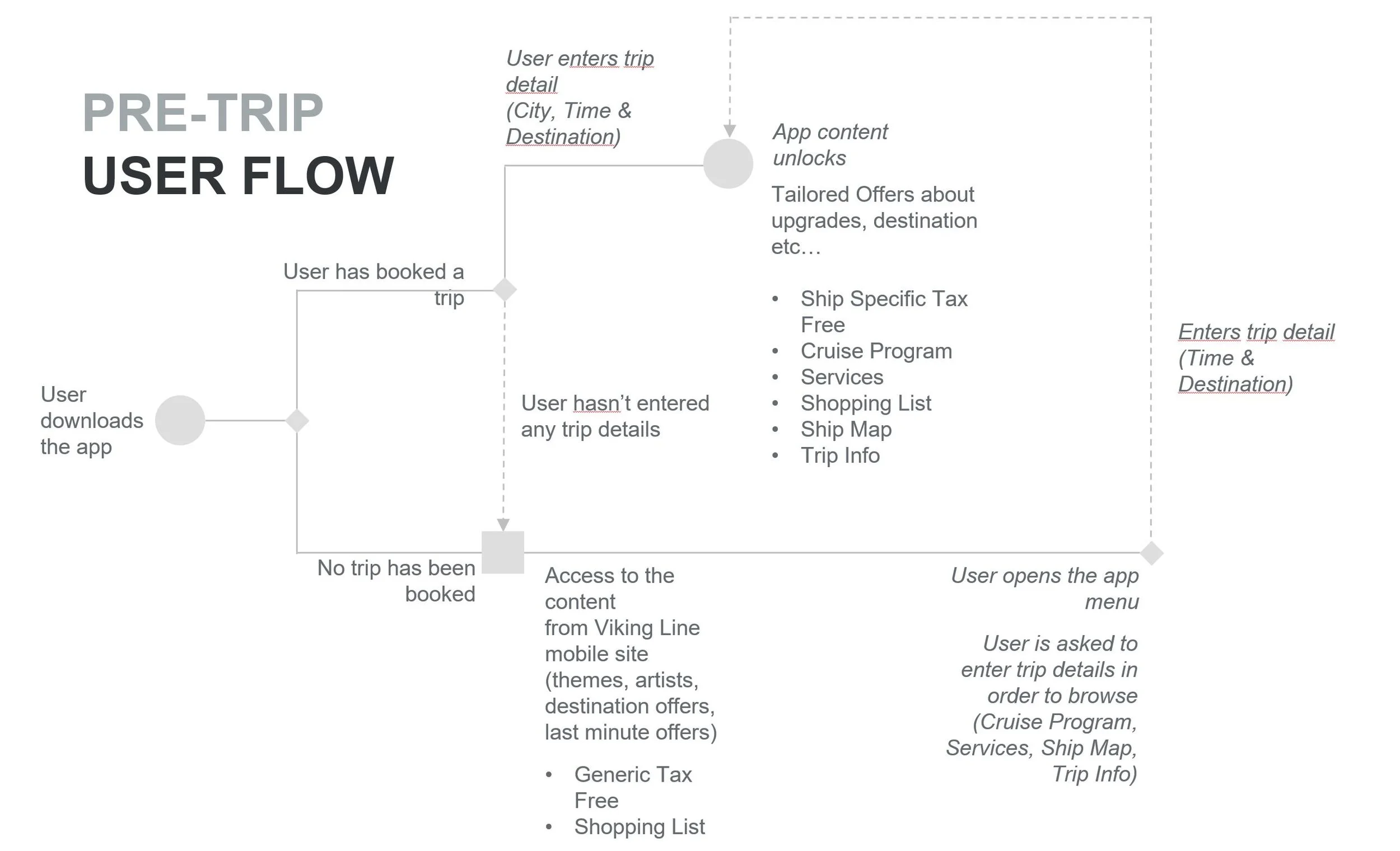
This flow diagram shows what happens in the app when the user is ashore.
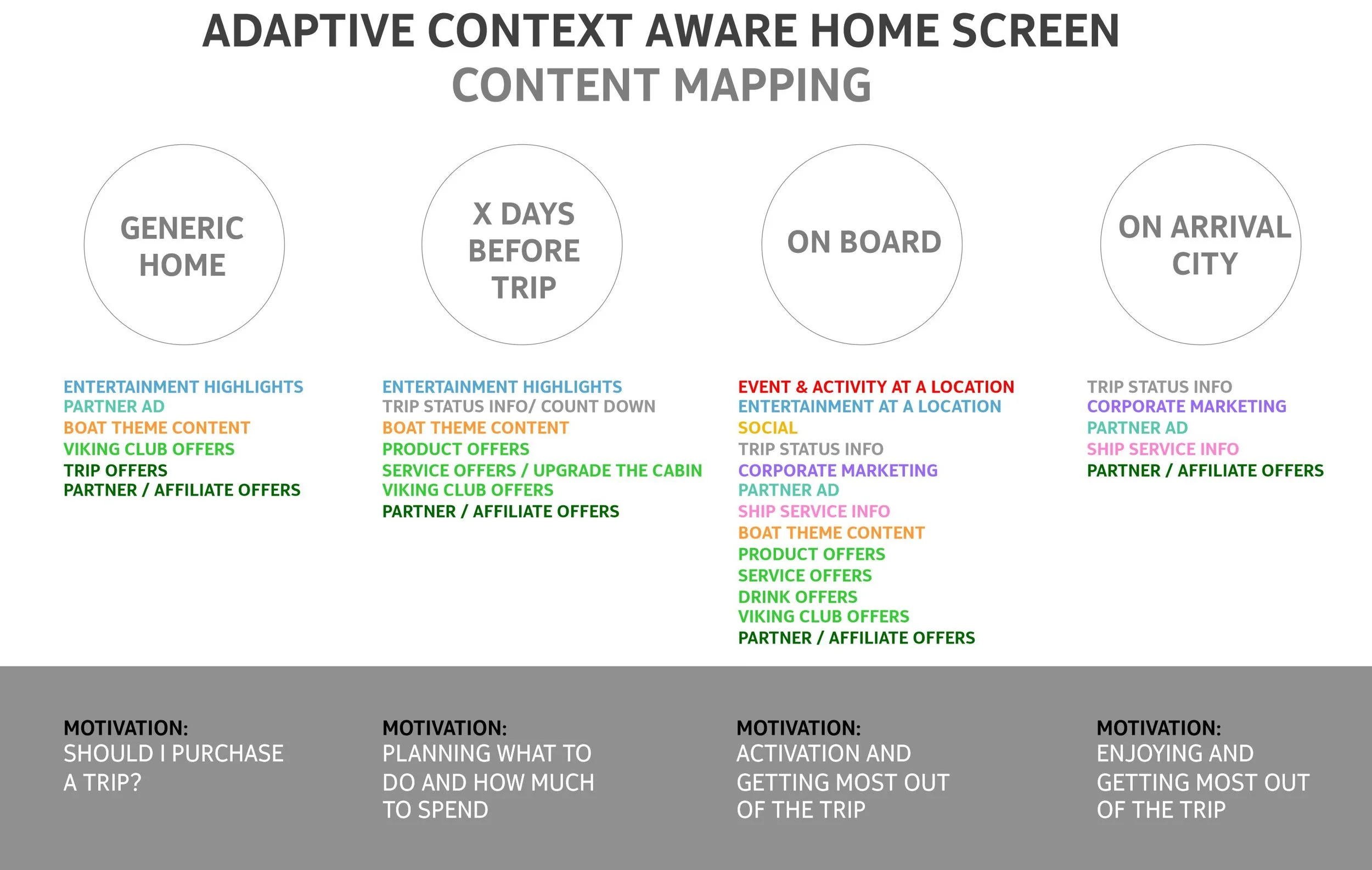
Not only are some of the features of the app locked away while ashore, the actual main home screen is made adaptive to the location and time.
Due to alcohol, tobacco and gambling laws, it isn't possible to show all the content ashore, but sail away and you can smoke and drink and gamble yourself to death, if so desired.
We mapped out what are the important things to show to the passenger at each step of the way togther with the motivation to do so.
This is the current application's IA. A lot of compromises were made to accommodate all the functions.
The new application has a much more complex architecture, but a radically simplified UI.
I designed the new app according to analytics, dropping the entire menu, which people hardly touched, with a five-button tab bar.
The added functionality of the 2.0 version makes the app much better and functional.

